


How to ask WordPress not to add responsive attributes Images feature

Table of Contents
Do you have WordPress 4.4+ installed? All new images inserted in posts after the WP upgrade have scrset attribute then.
How scrset and sizes attributes work?
srcset ands sizes attributes contain the information to help browser decide which image size/file is the best.
<img src="image.jpg" srcset="image-300x188.jpg 300w, image-700x600.jpg 700w, image-1024x640.jpg 1024w, image-1200x750.jpg 1200w" sizes="(max-width: 709px) 85vw, (max-width: 909px) 67vw, (max-width: 1362px) 62vw, 840px">
What does it mean?
- scrset: If image width on the page is 300px or less, then browser will load and show image-300×188.jpg, if more than 300px and but less than 700px — image-700×600.jpg etc.
- sizes: max image width for the given media query, actually it loos like if-else-statement — if viewport width is 709px or less, the maximum image width is 85% of the viewport, if none of the statements is true, then max image width is 840px.
It was described great in CSS-Tricks screencast here.
As for me, I would like to talk about WordPress.
Responsive images — WordPress 4.4 new feature
WordPress is using the_content to add the responsive attributes to your uploaded images:
- If your image has wp-image-{ATTACHMENT_ID} class.
- If your image do not have already
scrsetattribute.
How to ask WordPress not to add responsive attributes to all content images
There are two ways — you can remove wp-image-{ATTACHMENT_ID} class from specific attachments or disable responsive images globally by adding this to your theme functions.php.
remove_filter( 'the_content', 'wp_make_content_images_responsive' );
How to add scrset and sizes attributes to WordPress attachments in the code.
<img src="<?php echo wp_get_attachment_image_url( $attachment_id, 'medium' ) ?>"
     srcset="<?php echo wp_get_attachment_image_srcset( $attachment_id, 'medium' ) ?>"
     sizes="<?php echo wp_get_attachment_image_sizes( $attachment_id, 'medium' ) ?>" />
Let’s look at each function separately.
wp_get_attachment_image_url()returns the URL of the image with the given image size (in the example — medium).wp_get_attachment_image_srcset()the function loops throught all image sizes and adds each size in scrset in the following format:image-{WIDTH}x{HEIGHT}.jpg {WIDTH}w. Please note, that the function ignores:- if resized image ratio differs from the original more than 0.002
- if resized image was edited
- if resized image width is more than maximum scrset image width (by default 1600 but can be hooked)
wp_get_attachment_image_sizes()if themes or plugins don’t hook this function, it returns the following(max-width: {WIDTH}px) 100vw, {WIDTH}px, where {WIDTH} is the factical width of the file.
How to use images with different ratio for mobile devices
Look at the picture below. Which image do you think looks better on this iPhone 5?
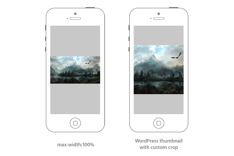
You may notice that image ratio (width/height) differs, so, WordPress wouldn’t add the right image size to scrset attribute. How to force it to do it:
function misha_sources( $sources, $size_array, $image_src, $image_meta, $attachment_id ){
/*
* Your variables here
*/
$image_size_name = 'square500'; // add_image_size('square500', 500, 500, true);
$breakpoint = 500;
$upload_dir = wp_upload_dir();
$img_url = $upload_dir['baseurl'] . '/' . str_replace( basename( $image_meta['file'] ), $image_meta['sizes'][$image_size_name]['file'], $image_meta['file'] );
$sources[ $breakpoint ] = array(
'url' => $img_url,
'descriptor' => 'w',
'value' => $breakpoint,
);
return $sources;
}
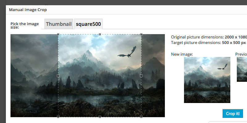
add_filter('wp_calculate_image_srcset','misha_sources',10,5);For better user experience you can use the Manual Image Crop plugin to crop image the way you want.